Live Rooms
I created an MVP of a live social audio experience for native mobile and later iterated on the initial MVP as well. Moderated and hosted by our newsroom, Live Rooms are a way for fans to connect directly with their favorite sports reporters.
Company
The Athletic is the best newsroom in sports for every major professional and college league. For a monthly subscription sports fan can access thousands of new articles every month, participate in live audio discussions with fans and writers, listen to hundreds of podcast shows, and follow every game their heart desires.
Objective
Historically The Athletic had relied heavily on long-form journalism to engage subscribers. Despite having over a million subscribers of passionate sports fans, there was little to no community presence within the product. I was assigned to create a social audio experience that would allow fans to talk directly with one another and with our writers. Though similar to Clubhouse or Twitter Spaces in concept, we believed that we could create a significantly differentiated product through reporter-led discussions.
Wireframes and User Flows
To start we mapped out what all of the individual flows would be for the experience. I usually use user flow diagrams for this stage, but opted to make rough wireframes since I knew most of the experience would essentially be a single-screen experience with lots of small, isolated features. Within just a day or so work we were able to visualize what we would need to create on the user and creator side of this experience.
The Main Room
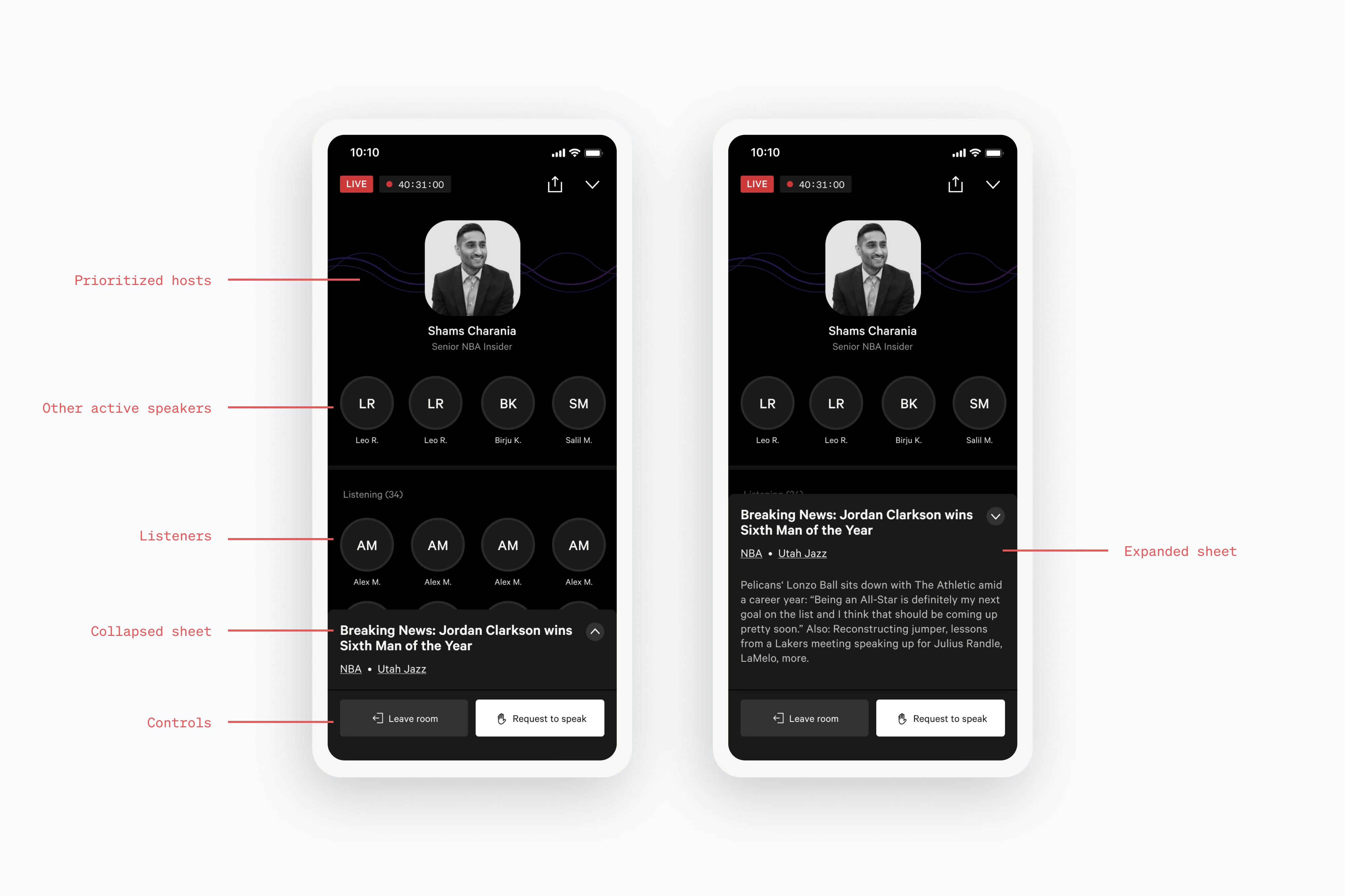
We spent a lot of time thinking through the architecture of the main room. Every feature needed to live on one screen and I knew the basic structure needed to be extremely intuitive.
All of the above explorations are rough, but aim to depict an overall architecture that we could use for speakers, the audience, the controls, and information about the room. Some are better than others, but none felt like they had the right hierarchy that we were looking for.

After a lot more exploration we arrived at the possibility of using a mobile sheet for the metadata. This unlocked the possibility of keeping speakers prioritized at the top while also allowing us to surface room information to the user without leaving the main room.
Controls
With the overall architecture in place we moved our attention to the controls next. We knew that if the controls felt intuitive, the rest of the flows would come together naturally.
Notifications
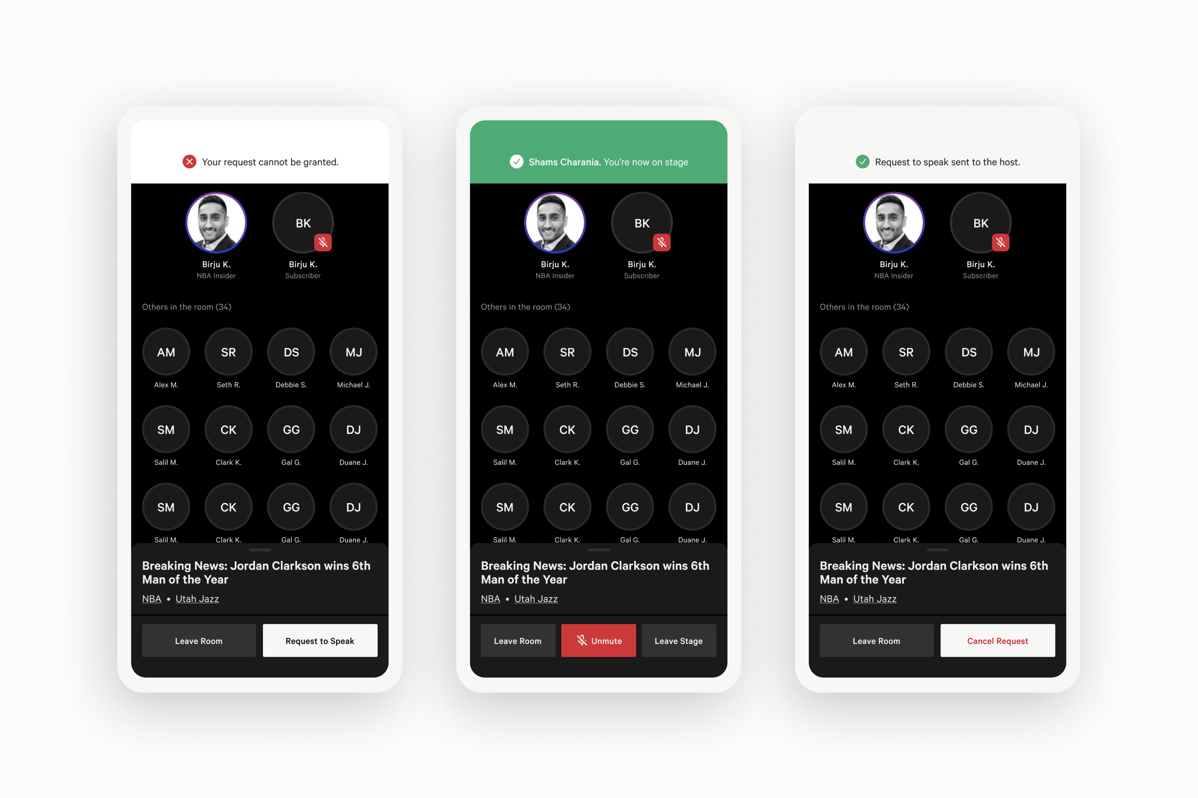
With the main room and the controls in place, the last new component we knew we needed to create was a notification system. This was critical to give users an easy way to follow their state through the experience. This was the first live, interactive feature in our app and we didn't have anything like this already in our design system.
Listener Designs
With the major individual components in place, the rest of the experience came together pretty seamlessly. Using our initial wireframe flows as a guide we were quickly able to put together the end-to-end experience.
Creator Designs
Another major component of this project was designing the flows for creating a room. Unlike in Clubhouse or Twitter Spaces, creating a room can only be done by a newsroom host at The Athletic.
This is some text inside of a div block.